Cafe Website Design: 7 Elements That Bring Customers In
A café website brings customers in when it nails seven elements: a readable text menu, location and opening hours reachable in two taps, atmospheric photography, a story page that builds belonging, sub-three-second mobile speed, visible reviews, and one clear call to action on every page. Most café sites fail on the first three — and those are the cheapest to fix.
Key takeaways
- The menu page is your most-visited page — it must be real text, not a PDF, readable on a phone.
- Atmosphere is the product: photograph the room, the light and the cups, not just the coffee.
- Under 3 seconds load time on mobile; most visitors decide while walking nearby.
- Google Business Profile + consistent details on your site = visibility in "coffee near me" searches.
- Every page needs exactly one job: reserve, pre-order, call, or find us.
- A café site is cheaper than a restaurant site — typically an estimated €0–€3,000 one-off or €49–€189/month.
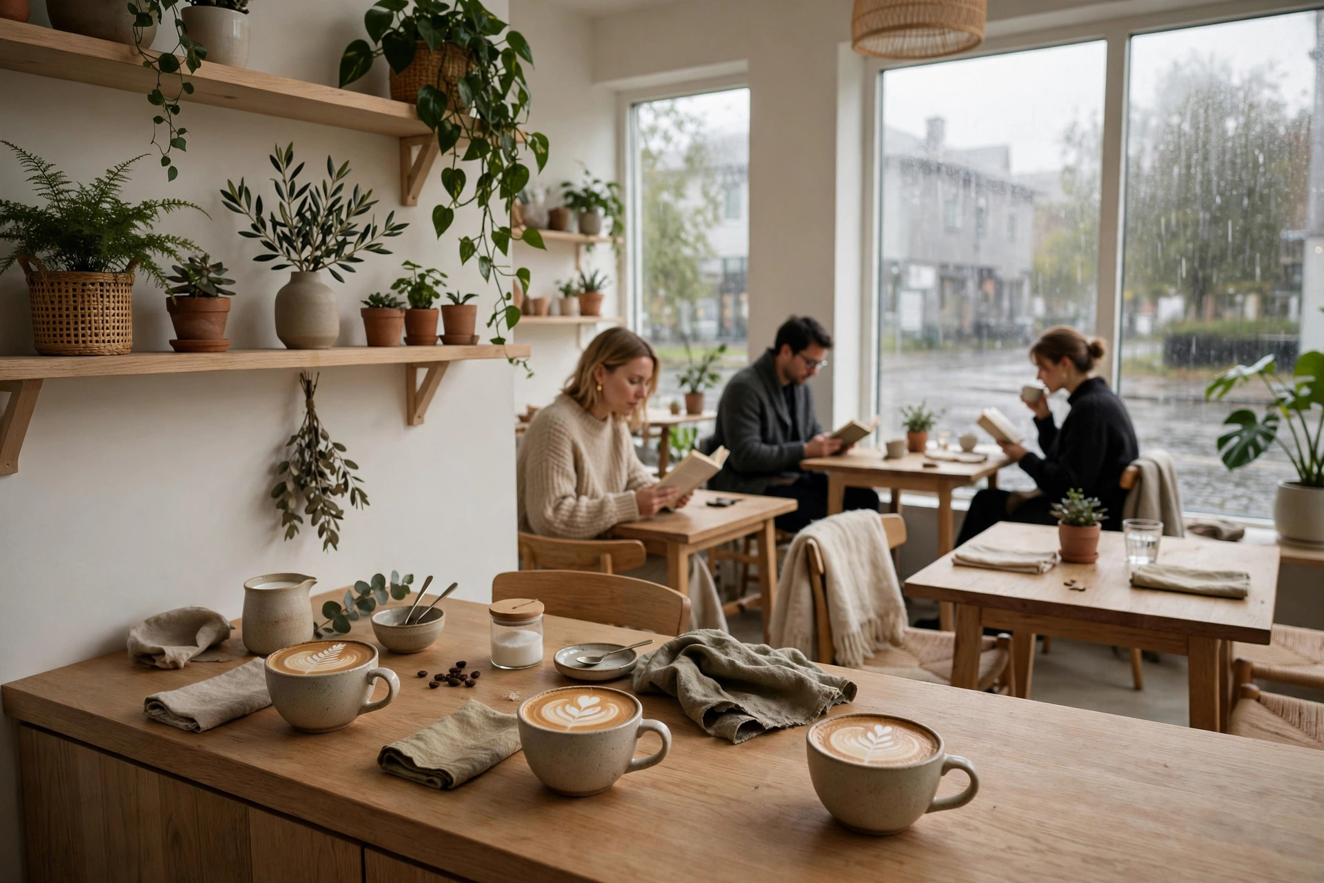
Nobody chooses a café the way they choose a restaurant. A restaurant gets researched: menus compared, reviews weighed, tables booked days ahead. A café gets chosen in the moment — someone is nearby, it is raining, they want somewhere warm with good coffee and a chair that does not hurt. Your website has about ninety seconds, usually on a phone, usually while the person is already half-decided. This guide breaks down the seven elements that turn that ninety seconds into a visit, plus how café sites differ from restaurant sites and the quiet mistakes that cost cafés customers every week. It is written for independent café and coffee-shop owners in the Nordics and internationally, with concrete, do-this-today advice.
1. A menu people can actually read
The menu is the single most-visited page on any food-and-drink website — restaurant web research consistently finds the majority of visitors arrive specifically to browse it. And yet café menus online are routinely terrible: a scanned PDF, a photo of the chalkboard taken at an angle, or an Instagram highlight that expired in 2024.
Text, not pictures of text
Your menu must be real HTML text. PDF menus force phone users to pinch, zoom and squint; they are invisible to Google; and updating a price means re-exporting a file instead of editing a line. Real text also lets you do the things that sell: mark the vegan and gluten-free options with clear icons, add one-line descriptions to the signature drinks ("cardamom bun latte — our autumn classic"), and show prices without apology. Customers who cannot find the price assume it is expensive.
Organise it like a customer thinks
Group by decision, not by your supply chain: "Espresso drinks", "Filter & brews", "Something sweet", "Lunch". Keep the list short enough to scan in thirty seconds — decision fatigue is real, and a café menu with forty items reads as chaos, not choice. If you have seasonal drinks, give them their own small section at the top; regulars check back specifically for those.
2. Location and opening hours in two taps
The second-most-common reason someone opens your site: "Where is it, and is it open right now?" Answer both within two taps from the homepage, on a phone, with cold hands.
What "two taps" means in practice
- Address in the header or hero, linked to Google Maps — not buried on a contact page.
- Today's hours shown automatically, with holiday exceptions updated in advance. A café that still shows summer hours in November looks abandoned.
- Tap-to-call phone number on mobile. People call cafés for simple things — "are you open?", "do you have oat milk?" — and a number they cannot tap is a question they will not ask.
- How to find you: nearest tram stop, parking situation, which entrance. In Nordic city centres this matters more than owners think — a café two minutes from the metro beats a better café ten minutes away.
Keep Google in sync
Your Google Business Profile is where most "coffee near me" decisions actually happen, often without anyone ever opening your site. But Google trusts businesses whose details match everywhere: the name, address and phone number on your website must be identical to your profile. Link your menu page from the profile, keep holiday hours updated in both places, and add fresh photos regularly — profiles with recent photos get noticeably more direction requests. This costs nothing but discipline.
3. Photography that sells the atmosphere
Here is what most café websites get wrong about photos: they show the coffee. Close-up, beautiful, technically perfect coffee. But nobody chooses between two cafés based on whose flat white photographs better. They choose based on the room — the light, the chairs, the feeling of sitting there for an hour with a book while it rains outside.
Photograph the seat, not just the cup
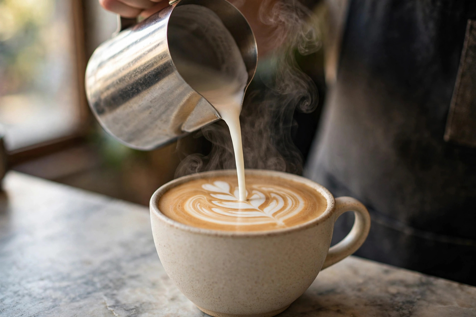
Your photo set should answer: what does it feel like to be here? Wide shots of the room in natural light. The window seats. The shelf of plants, the worn wooden counter, the barista mid-pour. Detail shots — a croissant's layers, steam over a cup — work as seasoning, not the main dish. And photograph people, or at least the traces of people: an open book next to a finished cup says "stay a while" more honestly than any copywriting.
The Nordic light problem (and opportunity)
In Helsinki, Stockholm and Oslo, winter daylight is a rumour. Cafés that photograph beautifully in June look like caves in January — which is exactly when people most want a warm room. Shoot a winter set deliberately: warm lamps on, candles if you have them, the contrast of dark windows and golden interior. That image, used November to March, will outperform any summer shot. One professional shoot a year (€200–€600 estimated) covering both seasons is the best content money a café can spend.
4. A story page that makes regulars
Chains sell consistency. Independent cafés sell belonging — and belonging needs a story. The "About" or "Our story" page is where a first-time visitor becomes someone who roots for you.
What to actually write
Not your mission statement. The real things: who started the café and why, where the beans come from and why those beans, what the room used to be, the regulars' rituals (the Tuesday chess club, the dog-friendly corner). Name the people — the head barista, the baker. Specifics are believable; adjectives are not. Two hundred honest words beat two thousand polished ones.
Why it converts
A story page does quiet commercial work. It gives journalists and bloggers something to quote, it gives Google unique text no competitor has, and it gives the visitor a reason to choose you over the identical-looking café across the street. In an industry where the product is genuinely similar everywhere, "I like these people" is a defensible competitive advantage. Write it once, update it yearly, link it from the homepage — not hidden in the footer.
5. Speed and mobile-first design
Most of your visitors are on phones, many on mediocre connections, deciding in the moment. Every second of load time costs you some of them — and café sites are repeat offenders, bloated with full-screen video backgrounds and uncompressed photo galleries.
The practical speed checklist
- Under 3 seconds on 4G for the homepage. Test on a real mid-range phone, not your office fibre.
- Compress every image before upload; a hero image has no business being 4 MB.
- No auto-playing video backgrounds. A still photo loads instantly and says the same thing.
- Design mobile-first: big tap targets, readable type without zooming, the menu usable one-handed.
Accessibility is not optional polish
Good contrast, real text (not text baked into images), alt descriptions on photos, keyboard-navigable menus. This is partly legal hygiene in the EU and partly just good business: your oldest regulars are also the ones most likely to need larger type and higher contrast. A site your grandmother can use is a site everyone can use.
The 90-second test
Hand your phone to a friend who has never seen your site. Ask them to find the menu, the address and today's opening hours — timed. If any of the three takes more than 90 seconds, you have found your next fix. Run this test twice a year; sites rot as content gets added.
6. Reviews and trust signals
Café choice is low-stakes but high-frequency — people will try somewhere new on a 4.6-star average and a photo of a nice room. Reviews are the cheapest trust signal you have, and most cafés underuse them badly.
Make Google reviews visible — and answer them
Embed or link your Google reviews rather than inventing testimonial quotes (never invent reviews — customers detect it instantly and it poisons everything else you claim). More importantly, reply to reviews: thank the kind ones specifically, answer the critical ones gracefully and factually. A thoughtful owner reply to a 3-star review convinces more future visitors than ten 5-star ratings with silence. Aim for a steady flow — a profile whose newest review is from eight months ago reads as a café in decline, even when it is thriving.
Earn reviews systematically
Do not beg; make it frictionless. A small table card with a QR code to your Google profile, a mention on the receipt, staff who mention it when someone compliments the coffee. The cafés with hundreds of reviews did not get lucky — they built a habit. And watch what reviews mention: if three people praise the cinnamon buns, that is your homepage photo and your menu headline.
7. One clear action on every page
Every page of your site should have exactly one job. The homepage's job might be "see the menu"; the menu page's job "find us"; the story page's job "follow us". What kills café sites is pages with no job at all — pretty, informative, and ending nowhere.
Pick actions that fit a café
- Pre-order for pickup — the highest-value action for most cafés. Morning commuters order ahead, skip the queue, and spend more. If your 8 a.m. queue is a bottleneck, this pays for the whole site.
- Reserve a table — for cafés with brunch service or laptop-friendly seating.
- Get directions / call us — the default action for location and contact pages.
- Join the mailing list — for seasonal menus and events; a small list of real regulars beats any social following for filling a quiet Tuesday.
One action per page, repeated calmly — not five competing buttons. The visitor should never have to decide what to do next; the page decides for them. Providers who build restaurant sites for a living, like PowerfulWebsite, treat this as the core of the design: every template starts from the action, and the decoration follows.
How café sites differ from restaurant sites
It is tempting to copy restaurant website advice wholesale. Do not — the businesses differ in ways that change the site:
| Café website | Restaurant website | |
|---|---|---|
| Primary visitor intent | "Is it good / open / near me?" — decide in the moment | "What's the menu / can I book?" — research ahead |
| Key conversion | Visit, pre-order pickup, follow | Table reservation, delivery order |
| Menu complexity | Short, scannable, seasonal specials highlighted | Longer, courses, allergens, wine lists |
| Photography focus | Atmosphere and room; the feeling of staying | Dishes; the food as the hero |
| Ordering | Click-and-collect pre-order; delivery rarely pays | Full delivery integration often essential |
| Content rhythm | Frequent small updates: seasonal drinks, events | Slower: menus change seasonally |
| Typical build cost (estimate) | €0–€3,000 one-off; €49–€189/month | €0–€5,000+ one-off; €49–€189/month |
The practical takeaway: a café site should be lighter, faster and more atmospheric than a restaurant site, with less emphasis on transactions and more on the feeling of the place. If an agency pitches you the same package they sell to fine-dining restaurants, ask what they would remove for a café — the answer tells you whether they understand the difference.
Mistakes that quietly cost cafés customers
A short rogues' gallery, because these are all fixable this week:
- The PDF menu. Unreadable on phones, invisible to Google, painful to update. Move it to real text and watch menu-page engagement change.
- Stale hours. Holiday hours from last year, or "open daily" with no times. Every wrong-hours visit is a customer who will not give you a second chance.
- Stock photos of coffee. Generic latte art from a photo library tells visitors nothing about your room — and regulars can tell. Use your own photos, even imperfect ones.
- No address above the fold on mobile. If finding you requires scrolling, tapping through menus and guessing, the café down the street wins.
- Social-only presence. Instagram is where regulars follow you; it is not where new customers find you. Search is, and search needs a website.
- The silent site. No updates in a year, no seasonal drinks, no events. A living site signals a living café — post the autumn menu the day it launches.
None of these require a rebuild. Each is an afternoon's work, and together they are the difference between a site that exists and a site that brings people through the door. For a deeper look at what restaurant websites cost when you do decide to rebuild, see our restaurant marketing guides — including the full 2026 pricing breakdown for pizzeria websites.
Local SEO: getting found when it matters
A beautiful café site that Google cannot understand is a billboard in a basement. Local search engine optimisation is not a mysterious discipline — for a café it comes down to three things Google can verify: relevance, distance and prominence. You cannot change your distance from the searcher, but you fully control the other two.
Relevance: speak the customer's language
Your page titles and headings should use the words customers actually type: "café", "coffee shop", "brunch", plus your neighbourhood and city — "café in Kallio", "coffee shop near Central Station". Do not get clever with the homepage title; "Café Aamu — speciality coffee in Kallio, Helsinki" beats "Where mornings begin" every time, because Google matches words, not poetry. Each core page (menu, location, story) gets one clear topic and one clear title. One page per topic, one topic per page — that is 80% of on-page SEO for a local business.
Prominence: be the obvious choice
Prominence is Google's measure of how well-known you are: review count and rating, local press mentions, listings in local directories, links from neighbourhood blogs. Your website earns these by being worth linking to — the story page journalists quote, the menu page bloggers link when they write "best brunch in town" roundups. Then make sure the basics are consistent everywhere: identical name, address and phone number on your site, your Google profile and every directory. Inconsistencies ("Café Aamu" vs "Cafe Aamu Oy") dilute the trust signals you have earned.
The technical minimum
You do not need an SEO agency for this. You need: one page per topic with a descriptive title, fast mobile loading, the menu as real text, alt descriptions on images, and a sitemap submitted to Google Search Console (free, twenty minutes). Add structured data for a local business — opening hours, address, geo-coordinates in machine-readable form — and Google can display your hours and busy times directly in search results. Check Search Console quarterly: it tells you exactly which searches show your site and which pages people click. That report is worth more than any generic SEO advice, because it is about your café, not cafés in general.
Frequently asked questions
What should a café website include?
At minimum: a readable text menu with prices, your address with a map, current opening hours, a tap-to-call phone number, and photos of the space and the coffee. Beyond that, the elements that bring customers in are a story page, visible reviews, fast mobile loading, and one clear call to action on every page — such as a reservation or pre-order button.
How much does a café website cost?
A café website costs an estimated €0–€3,000 as a one-off build in 2026, or €49–€189 per month on a subscription that includes hosting and maintenance. Cafés usually need less than restaurants — no complex booking system, often no online ordering — so costs sit at the lower end unless you add pre-ordering or loyalty features.
Why does my café need a website if I have Instagram?
Instagram is rented space: you do not control the algorithm, and nobody finds your opening hours there when they search 'coffee near me' on Google. Your website is the one place you own — it answers the three questions every visitor has (what do you serve, where are you, when are you open) and it feeds Google the structured information that puts you on the map, literally.
What is the most important page on a café website?
The menu page. Restaurant web research consistently finds that the majority of visitors come specifically to browse the menu, and it is the page that most directly drives the decision to visit. It must be real text — not a PDF — readable on a phone, with prices and dietary markings.
How do I make my café show up on Google Maps?
Claim and complete your Google Business Profile: correct categories, accurate hours including holidays, your menu linked from your own website, and a steady stream of real photos and customer reviews. Your website supports this with consistent name-address-phone details, local keywords in the page titles, and fast mobile loading. There is no shortcut — completeness and activity win.
Should a café website have online ordering?
Pre-ordering for pickup suits cafés well: morning commuters order ahead and skip the queue, which smooths your rush and raises average tickets. Full delivery rarely pays for a café because tickets are small and delivery fees eat the margin. Start with click-and-collect if your morning queue is a bottleneck; skip delivery unless your average order justifies it.
Want a café website that fills tables?
PowerfulWebsite builds your café's website for free — you only pay from €49/month. Everything included: domain, hosting, maintenance and updates, with a design built around the one action that matters: getting people through your door.
See the packages