Fine Dining Website Design: How to Build Luxury Online
Fine dining website design is about restraint: generous white space, one elegant serif, a muted palette with a single metallic accent, one cinematic hero image, and a reservation button that is never more than one tap away. Build it around six pages — home, tasting menu, chef, reservations, private dining, contact — show your prices plainly, and budget an estimated €4,000–10,000 for an agency build or €89–189/month as a subscription.
Key takeaways
- Luxury is signalled by restraint: white space, one serif typeface, muted colours, few words. Clutter is what looks cheap.
- The homepage has one job — get the visitor to the reservation button. Everything else is secondary.
- Show tasting menu prices plainly; hiding prices creates friction, not mystique.
- Professional photography (€800–2,500 per shoot, est.) matters more than the design itself.
- Online reservations are non-negotiable — most bookings happen when nobody answers the phone.
- Realistic 2026 budgets: €4,000–10,000 via a boutique agency, or €89–189/month with everything handled.
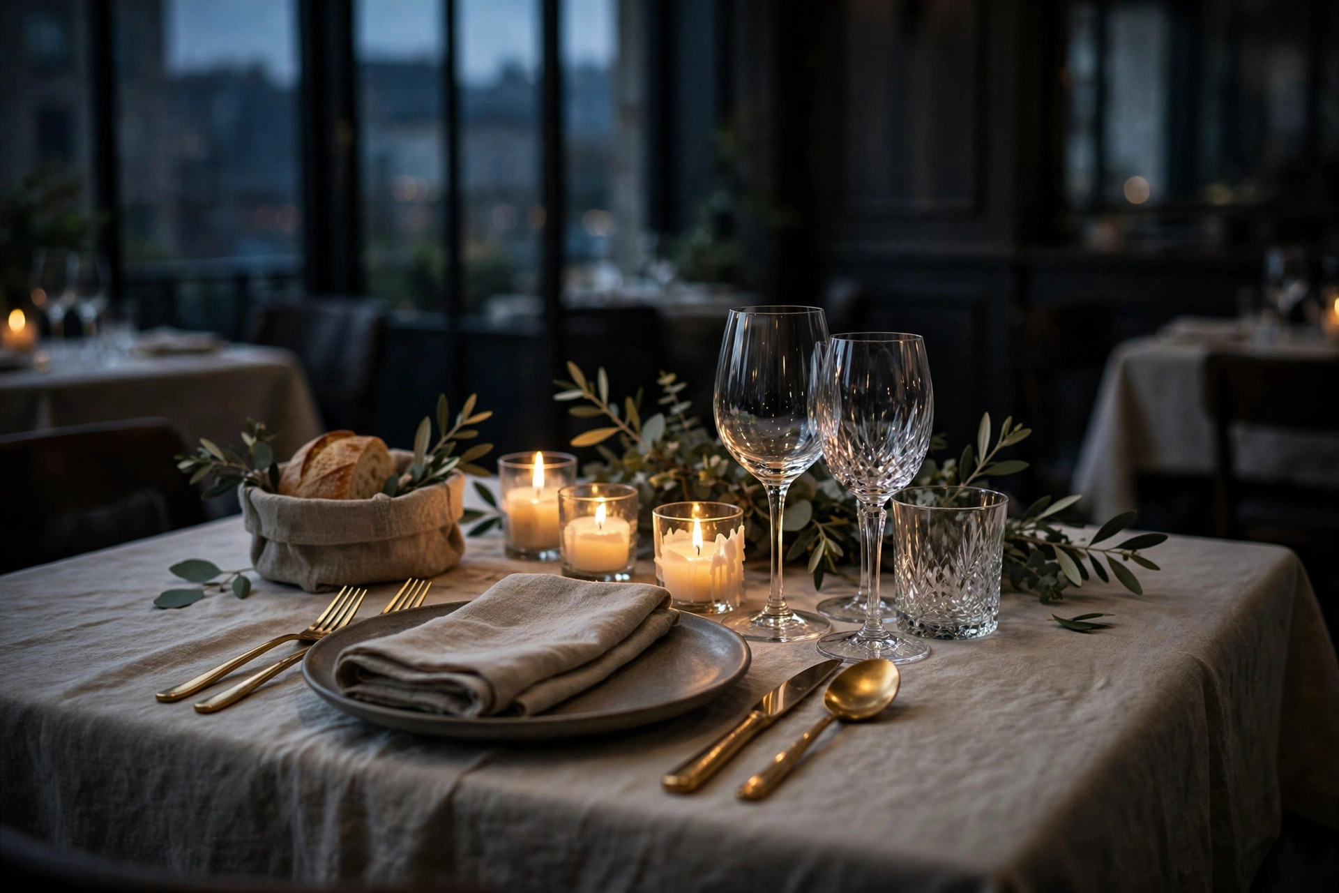
A guest choosing a fine dining restaurant is making a different decision from every other dining decision. It is not "where should we eat tonight" — it is "where should we celebrate", "where do we take the clients", "is this worth €200 a head". The website is where that decision gets made, usually days before the visit, usually on a phone, usually after comparing you with two competitors. Your site is not a brochure. It is the first course.
And here is what most fine dining websites get wrong: they confuse luxury with decoration. Gold flourishes, script fonts, autoplaying piano music, seventeen menu items — the visual equivalent of shouting. Real luxury, online as in the dining room, is quiet confidence: restraint, space, precision, and absolute clarity about the one thing that matters — the reservation. This guide breaks down how to build that, section by section, with honest 2026 cost ranges and the Nordic specifics (Michelin Guide Nordic Countries, White Guide, international tourists) that generic design advice misses.
What luxury feels like online
Walk into a great fine dining room and notice what is absent: noise, clutter, hurry. The table is set with precision and nothing else. The staff speak quietly. Luxury is the feeling that everything has been considered and nothing is accidental. A website creates the same feeling with the same tools — or destroys it with their opposites.
The opposites are depressingly common on restaurant websites: five typefaces, stock photos of food that is not yours, a popup begging for newsletter signups before the page loads, a PDF menu, a "click here for reservations" that leads to a phone number. Each one is a small crack in the illusion. A guest who would pay €180 for a tasting menu notices — perhaps not consciously, but the feeling of "this place has it together" either forms or it does not.
The practical translation: every element on a fine dining site must earn its place. Before adding anything — a section, an animation, a photo gallery — ask what it does for the reservation decision. If the answer is "it looks nice", it probably does not belong. The best fine dining websites in the world are almost boring in their structure: image, name, menu, story, reserve. The luxury is in the execution, not the inventory.
Apply the three-second test honestly: open your homepage on a phone and count to three. What has the visitor learned? If the answer is "the name, the mood, and that I can book a table" — you pass. If the answer is "there is a video loading and some text about our philosophy" — you fail, and the guest is already comparing your competitor. Fine dining guests arrive with high intent and low patience; they have already decided to spend the money, and your site's only task is to not give them a reason to hesitate.
The hero: one image, one reservation button
The hero — the first screen a visitor sees — is the entire pitch. For fine dining it should contain exactly three things: one extraordinary photograph, the restaurant's name, and a reservation button. Not a slideshow. Not a video background (it slows mobile loading and says nothing a still image cannot). Not three paragraphs of welcome text.
The photograph is the single most important asset on the site. It should be the dining room at its most beautiful, or one perfect dish — shot by a professional, in your actual light, of your actual food. This image does the work of a thousand adjectives: it tells the guest the price level, the mood, the ambition, before a word is read. Budget for it accordingly; a €1,500 photo shoot on a €6,000 website is not an extravagance, it is the point.
The reservation button rule
On every page, the path to booking must be visible without scrolling — on desktop and on mobile. Fine dining guests decide emotionally and book impulsively; every extra click between the impulse and the confirmation loses a percentage of them. The button should say "Reserve a table" or "Book now", not "Contact us" — "contact" sounds like effort, "reserve" sounds like the evening is already happening.
Typography and colour: the quiet codes of luxury
Guests cannot articulate why one site feels expensive and another feels cheap, but designers can: it is almost entirely typography, colour and space. The good news is that the code is simple and well-established.
Typography: one elegant serif for headings (think Cormorant Garamond, Playfair Display, or a licensed equivalent), one clean sans-serif for body text. Large headings, generous line spacing, short paragraphs. Never more than two typefaces; never script fonts for body text; never all-caps paragraphs. Serif headings signal heritage and craft — the visual equivalent of a handwritten menu card.
Colour: a restrained palette of two or three colours. The classic fine dining combinations — charcoal and cream, deep green and brass, midnight blue and gold — all work because they do the same thing: dark or neutral ground, one metallic accent used sparingly. The accent colour should appear on perhaps 5% of the page: the reservation button, thin dividers, small labels. Gold everywhere is not luxury; gold used once is.
Space: white space is the most underused luxury signal. Crowded layouts feel cheap because they feel desperate — everything competing for attention at once. Give each section room to breathe: wide margins, one idea per screen, images given full width. A page with half the content and twice the spacing will always feel more expensive than its crowded twin.
| Signals luxury | Signals cheap | |
|---|---|---|
| Typography | One serif + one sans-serif, generous sizing | Three+ fonts, script body text, all-caps blocks |
| Colour | Two neutrals + one metallic accent, used sparingly | Bright primaries, gradients, gold everywhere |
| Imagery | Few large professional photos of your food and room | Many small stock photos, clip art, watermarks |
| Motion | Subtle fades, calm scrolling | Autoplay video, popups, bouncing badges |
| Copy | Short, confident, precise | Long welcome paragraphs, exclamation marks, "world-class" |
Gold everywhere is not luxury. Gold used once is.
The menu page: tasting menus, wine and pricing
The menu page is your most-visited page after the homepage, and for fine dining it carries more weight than for any other restaurant type — because the menu is the product. Guests do not just check what you serve; they evaluate whether the evening is worth the price. The page must make that evaluation easy and pleasurable.
Present the tasting menu as real text on the page: courses listed in order, each with a one-line description that evokes rather than inventories ("charred leek, brown butter, aged Comté" beats "leek soup with cheese"). Show the price plainly — tasting menu, wine pairing supplement, and any additions. The old fine dining habit of hiding prices is a conversion killer: a guest planning a €250 evening who cannot find the price assumes the worst, or simply books the competitor who was transparent. Transparency is part of luxury now.
Wine lists and dietary information
A wine list does not need to be exhaustive online — the full cellar can live in the restaurant — but the pairing options and a sense of the list's character should be visible. Sommelier's picks, a few flagship bottles, the pairing price: enough for a wine-interested guest to feel looked after. Dietary information deserves equal care: vegetarian/vegan tasting menus, allergen handling, and how to communicate needs when booking. In the Nordics, where dietary requirements are routinely accommodated, stating this clearly removes a real booking barrier for groups — the person with the allergy is often the one choosing the restaurant.
The price-transparency rule
If a guest has to email you to learn the tasting menu price, you have already lost the guests who will not email. List the menu price, the pairing supplement and the surcharges on the page. The restaurants that hide prices are not mysterious — they are just harder to book.
Telling the chef's story without bragging
Fine dining guests buy the story as much as the food — the chef's background, the philosophy, the sourcing. But there is a fine line between heritage and bragging, and most restaurant "About" pages fall on the wrong side of it. The rule: show, do not claim. "We use only the finest ingredients" is a claim anyone can make; "our vegetables come from three organic farms within 40 km, named below" is a story no one can copy.
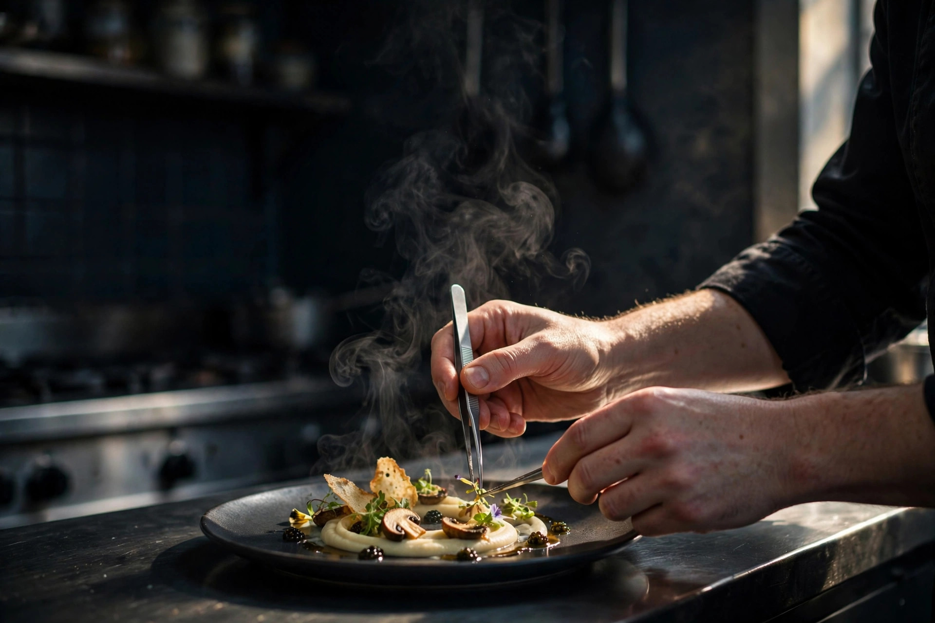
Structure the story page around specifics: where the chef trained (facts, not adjectives), the kitchen's philosophy in two or three sentences, the producers by name, the dining room's design story. Keep it short — this page is visited by the already-interested, and its job is to deepen desire, not to deliver a biography. One strong chef portrait and two or three kitchen or dining-room images are enough.
Do not forget the team beyond the chef. The head sommelier, the restaurant manager, the pastry chef — naming them with one line each signals a serious operation and gives journalists, guide inspectors and curious guests the texture they look for. A "team" section of four or five people with real roles beats a 600-word chef manifesto every time, because it shows depth rather than ego. Keep the tone factual and warm; the moment the copy starts sounding like an award acceptance speech, shorten it.
Awards and guides: state them, do not decorate with them
Mentions in the Michelin Guide Nordic Countries, White Guide, or JRE matter enormously in the Nordics — they are often the reason a tourist finds you. State them plainly with the year: "Michelin Guide 2026", "White Guide Master Class". Do not build a trophy wall of logos; one line of text carries more dignity than a collage of badges. And never invent or embellish recognition — the guides' listings are public, and a false claim discovered by a guest is a trust catastrophe.
Frictionless reservations — including on the phone
Online booking is non-negotiable for fine dining. Consider when reservations actually happen: Sunday evening for next Friday, 23:40 after a friend's recommendation, from another time zone by a tourist planning a trip. In none of these moments does anyone want to call. A phone-only restaurant does not look exclusive; it looks closed.
Use a proper reservation system — in the Nordics that typically means DinnerBooking, Bookatable/TheFork, or a built-in widget — not a contact form pretending to be booking. The system must show real availability, take the party size and time, confirm instantly, and handle the practicalities: credit card guarantees for large parties, clear cancellation terms, dietary-needs fields. Every one of these reduces no-shows and staff admin, which is where the system pays for itself.
Mobile is where the booking happens
The majority of your visitors — and your bookers — are on phones. The reservation flow must work flawlessly on mobile: large tap targets, no pinching, no PDF confirmations, Apple/Google Pay or card entry that does not fight the keyboard. Test the entire flow yourself on your own phone before launch, from the homepage hero to the confirmation email. A luxury restaurant with a broken mobile booking flow is like a dining room with a stuck front door.
A phone-only restaurant does not look exclusive. It looks closed.
Private dining, events and gift experiences
For fine dining restaurants, the website's highest-value pages are often not the menu — they are private dining and gift experiences. A private dining room rented for a corporate dinner can equal a week of regular service; a gift card for a tasting menu sells itself in December. Both are bought online, by people who have never visited.
The private dining page needs: the room (photos, capacity seated and standing), what is included (exclusive staff, AV, aperitif options), example menus or minimum spends as estimates, and a dedicated enquiry form that reaches the events manager directly — not the general info inbox. Corporate bookers search "private dining [city]" with budgets attached; this page is a landing page for that search, so write it in their language: capacities, timings, what's included, how to enquire.
Gift experiences deserve the same care: tasting-menu gift cards, "chef's table" experiences, wine-pairing evenings as gifts. Make them purchasable online in under three minutes — every extra step loses Christmas shoppers. This is also the one place where a little seasonal marketing is appropriate: a tasteful December banner beats a popup, and it can be the site's best revenue-per-visitor page of the year.
Weddings and celebrations sit between private dining and gift experiences, and they deserve at least a section of their own. Couples planning a wedding dinner search "wedding dinner restaurant [city]" months in advance and shortlist almost entirely online. Give them what they need to shortlist you: capacity for the wedding party, whether you do full buyouts, example formats (seated dinner, standing reception, ceremony-to-dinner flow), and a direct contact for the events team. One well-written page here can fill your quietest months.
International guests: language, guides and tourists
In the Nordics, fine dining and tourism are inseparable. A significant share of your covers — especially in Copenhagen, Stockholm, Oslo and Helsinki — will be visitors who found you through the Michelin Guide, White Guide, or a "best restaurants in [city]" listicle, and booked from abroad. Your website must serve them.
Practically, this means: an English version is mandatory, even if your primary audience is local. English is the language of international restaurant tourism, and a Finnish-, Swedish- or Norwegian-only site silently excludes the highest-spending segment. Keep the English version complete — menu, prices, booking — not a trimmed summary. Beyond English, consider what your actual guest data says; German and French summaries help in some markets, but a perfect English site beats three mediocre translations.
Also think like a tourist: they need the practical layer locals take for granted. Where exactly are you (with a map)? What's the dress code? How far from the city centre? What time do seatings start? A short "good to know" section answering these removes the hesitation that kills international bookings — nobody emails a restaurant in another country to ask about parking.
Finally, build the relationships that send tourists to your site: hotel concierges, local guides, and the experience platforms visitors actually use. A concise one-page PDF or a dedicated "for concierges" contact that hotels can share does more for international bookings than any advertising. When a concierge at a five-star hotel recommends you, the guest checks your website before committing — and in that moment, your English pages, your clear prices and your working reservation system are the entire pitch.
What a fine dining website costs in 2026
Fine dining websites cost more than bar or café sites for one reason: the design has to be flawless, because the site is selling a €150–300 evening and any crack in the polish costs bookings. Here are realistic 2026 ranges, all as estimates:
| Route | Typical cost (est.) | Timeline | Best for |
|---|---|---|---|
| Freelancer / template-based | €1,500–4,000 one-off | 3–6 weeks | Bistros stepping up; single venues on a budget |
| Boutique agency | €4,000–10,000 one-off | 6–12 weeks | Established fine dining; guide-listing ambitions |
| Luxury studio / fully custom | €10,000–25,000+ | 3–6 months | Restaurant groups, hotels, flagships |
| Subscription (e.g. PowerfulWebsite) | €89–189/month, €0 build cost | Days | Hands-off: design, hosting, updates included |
Two costs are routinely forgotten. First, photography (€800–2,500 per shoot as an estimate in the Nordics) — usually quoted separately, and worth more than any design upgrade. Second, copywriting: fine dining copy in flawless English (and your local language) is a specialist skill; bad copy on a beautiful site is like a stained tablecloth in a beautiful room. Budget for both, or choose a service that includes them.
The subscription model's quiet advantage for fine dining is maintenance: menus change seasonally, wine lists rotate, holiday hours shift, and a site that still shows the spring menu in October damages exactly the clientele you can least afford to lose. Services like PowerfulWebsite build the site free and keep everything current for a monthly fee — worth comparing against the cost of paying an agency for every seasonal update. For a sense of what comparable venues pay, see our 2026 website cost guide for pizzerias and the seven elements of café website design, which shares the photography and mobile principles that matter here too.
Bad copy on a beautiful site is like a stained tablecloth in a beautiful room.
SEO for fine dining: ranking for "fine dining [city]"
Fine dining SEO is simpler than most agencies pretend, because the searches are few and valuable: "fine dining [city]", "Michelin restaurant [city]", "tasting menu [city]", "romantic restaurant [city]". Ranking for them requires the basics done exceptionally well rather than any exotic technique.
The checklist
- One page per intent. Your homepage targets "fine dining [city]"; the menu page targets "tasting menu [city]"; private dining targets "private dining [city]". Each page needs the phrase in its title, heading and first paragraph — naturally, not stuffed.
- Google Business Profile, perfected. Correct categories ("Fine dining restaurant"), 30+ professional photos, menus uploaded, hours including holidays, and replies to every review. For "near me" searches this profile outranks websites entirely.
- Reviews as content. Guide mentions and press coverage should be referenced on the site with dates — "Michelin Guide 2026" as text, which Google reads. Never invent recognition; the guides publish their lists.
- Speed and mobile. A slow site does not just lose visitors; Google demotes it. Under three seconds on mobile is the target, same as for any restaurant site.
- Structured data. Restaurant schema (name, address, hours, price range, menu URL, reservation link) helps Google display your details directly in search results — the rich result with hours and "reserve" link is worth more than a ranking position.
What not to do: buy links, stuff keywords, or publish a blog you will abandon. Fine dining SEO is won with a small number of excellent pages kept permanently current — the same restraint the design demands.
FAQ
What makes a fine dining website look expensive?
Restraint. Expensive-looking fine dining sites use generous white space, one elegant serif typeface, a muted palette (charcoal, cream, one metallic accent), a single cinematic hero image, and very few words on the homepage. Luxury online is signalled by what you leave out — clutter, popups, stock photos and exclamation marks are what cheapen a site, not the absence of features.
How much does a fine dining website cost in 2026?
Estimates for 2026: a freelancer or template-based build typically runs €1,500–4,000; a boutique agency build €4,000–10,000; a luxury studio or fully custom site €10,000–25,000 and up. Professional food photography (€800–2,500 per shoot) is usually quoted separately and matters more than the design itself. Subscription services with zero build cost run roughly €89–189 per month.
Should a fine dining website show prices?
Yes — show the tasting menu price clearly. Fine dining guests are committing to a €100–300 evening; hiding the price does not create mystique, it creates friction and lost bookings. List the tasting menu price, wine pairing supplement and any surcharges (water, bread, service) plainly. Transparency is part of luxury.
Do I need online reservations, or is a phone number enough?
You need online reservations. A large share of fine dining bookings happen outside service hours — late evenings, weekends, across time zones for tourists — when nobody answers the phone. A phone-only restaurant loses every guest who will not call. Keep the phone number visible for special requests, but the default path must be a booking system that confirms instantly.
How many pages does a fine dining website need?
Six pages cover almost every fine dining restaurant: Home, Menu (tasting menu + wine), About/Chef, Reservations, Private dining & events, and Contact/Find us. A gallery and a gift-experiences page are useful additions. Anything beyond that — blog, news, press archive — should only exist if someone will actually maintain it.
How should I photograph food for a fine dining website?
Hire a photographer who shoots restaurants, not weddings — food photography is its own discipline. Shoot in the dining room's actual light, plate real dishes from a real service, and favour dark, moody backgrounds that match fine dining's visual language. Budget roughly €800–2,500 per shoot in the Nordics; one good shoot produces a year's worth of website, Google profile and social imagery.
Want a website worthy of your dining room?
PowerfulWebsite builds your restaurant's website free — you only pay from €89/month. Everything included: design, photography direction, reservations setup, hosting and updates.
See the packages