Menu Pricing Psychology: 9 Tactics That Sell More
Menu pricing psychology is the art of presenting your prices so guests focus on the dish, not the cost. Nine tactics — from dropping the € sign and choosing .95 or round endings, to anchor dishes, the decoy effect and strategic bundling — can lift your average ticket by several percent without changing a single recipe.
Key takeaways
- Guests read prices in relative terms, not absolute ones — every dish is judged against the dishes around it, so presentation matters as much as the number.
- The cheapest tactic, dropping the € sign, is backed by real research: diners shown bare numbers spent more than those shown €24 or "twenty-four euros".
- Charm pricing (.95 endings) suits casual and value concepts; round numbers suit fine dining. Mixing them randomly on one menu sends mixed signals.
- One expensive anchor dish and one well-placed decoy can shift your whole menu's sales mix toward the items with the best margins.
- Test one tactic at a time and measure your average ticket for two to four weeks — that is how you know what actually worked.
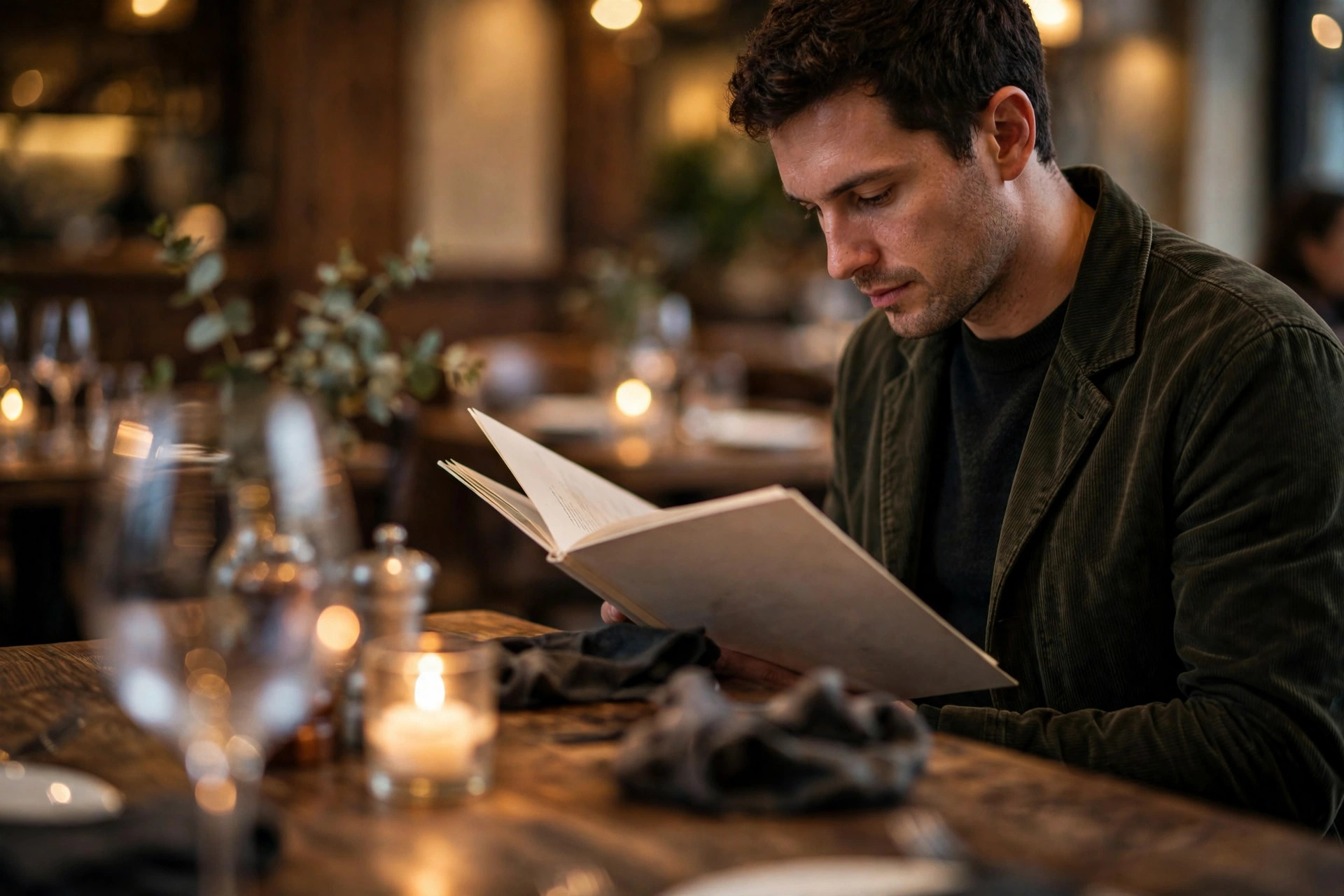
Your menu is the only salesperson every single guest meets. They spend roughly three minutes with it, and in those three minutes they make the pricing decisions that determine your average ticket. Most restaurant owners set prices with a calculator — food cost percentage, margin target, done. But the number is only half the story. How the number looks, where it sits, and what surrounds it changes how the guest's brain reads it.
This is menu pricing psychology: a set of well-documented techniques for presenting prices so that guests spend a little more, a little more freely. None of it requires new equipment, new staff or new recipes. It requires an afternoon with your menu document — and this article walks you through nine tactics, with concrete Nordic examples, realistic expectations, and a measurement plan so you can prove to yourself that they work.
What is menu pricing psychology?
Menu pricing psychology is the application of behavioural pricing research to restaurant menus. The core insight is simple: diners do not read prices the way accountants do. A price of €18.95 is not processed as "eighteen euros and ninety-five cents"; it is processed as a feeling — cheap or expensive, worth it or not — shaped by the digits, the symbols around it, the dishes above and below it, and the words that introduce it.
Decades of pricing research have identified recurring patterns in how people respond to price presentation. The left-digit effect makes 19.95 feel much cheaper than 20.00 even though one cent separates them. Anchoring means the first price a guest sees becomes the mental benchmark for everything after it. The decoy effect means an unattractive middle option can push guests toward the most profitable choice. These are not tricks in the dishonest sense — the prices are the prices — they are presentation choices, and presentation is a legitimate part of marketing.
Why it matters more for restaurants than for retail
A supermarket shopper can compare your jar of olives with three others on the shelf. A restaurant guest cannot compare your truffle risotto with anything. There is no shelf, no competitor's price tag, no "was €24, now €19" sticker. The menu is a closed pricing environment: the only references the guest has are the other dishes on the same page. That makes your menu the single most powerful pricing instrument you own — and the one most restaurants design by accident.
The honest ground rules
Before the tactics: pricing psychology is presentation, not deception. A few boundaries keep it honest. First, the tactic must never make a guest feel cheated afterwards — a €9.95 dish that arrives looking like a side plate destroys more trust than the tactic ever earned. Second, round your prices at honest thresholds: 24.95 is a real price, not a disguised 25. Third, tactics amplify a good menu; they cannot rescue bad food or sloppy service. If your average ticket problem is actually a quality problem, fix quality first.
Also worth knowing: these tactics are most effective on printed menus and well-designed digital menus, where you control layout and typography. On third-party delivery apps you control almost nothing — another reason your own menu, on your own site, matters. Our digital menus guide covers how to keep that control online.
Tactic 1: Drop the € sign
The single cheapest tactic on this list costs you one character per price — and it has the strongest research behind it. Write "24" instead of "€24". The currency symbol is a tiny alarm bell: every time the guest's eye lands on €, the brain registers a spending frame. A bare number reads as a detail; the same number with a symbol reads as a reminder that money is leaving the wallet.
This is not folklore. A widely cited study from the Cornell University School of Hotel Administration tested three menu versions — prices shown as numerals with a $ sign, as numerals without it, and written out in words — and diners who received the version with only numbers spent significantly more than the other two groups. The symbol group spent least, because every € or $ pulled their attention back to the transaction instead of the meal.
What the research found
In the Cornell experiment, menus that listed prices as bare numerals (24) outperformed both €24-style prices and prices spelled out as words. The interpretation: the currency sign triggers the "pain of paying" — the mild psychological discomfort of spending — while the bare numeral keeps the guest in a "choosing" frame. Removing symbols and decimals is now standard practice at most upscale restaurants across the Nordics.
How to implement it
Strip the € sign from every price on the menu, printed and digital. Add one plain line at the top or bottom — "All prices in EUR, incl. VAT" — so nobody is confused. That single disclosure handles transparency; repeating the symbol forty times handles nothing except your guests' anxiety. In Finland and Sweden this is fully legal as long as the prices shown are the final prices the guest pays, which they must be anyway under EU consumer rules.
One nuance for tourist-heavy restaurants in the Nordics: if you take multiple currencies or your guests often pay in kronor or kroner, keep the "All prices in EUR" line prominent. The symbol itself can still go. The goal is not to hide what things cost — the guest can still read "24" perfectly well — it is to stop interrupting their appetite with a tiny financial reminder on every line.
Tactic 2: Charm pricing vs round numbers
Charm pricing means ending prices just below a round number: 18.95 instead of 19.00. The mechanism is the left-digit effect — the brain reads prices left to right and gives disproportionate weight to the first digit, so 18.95 is filed under "eighteen-something" while 19.00 is filed under "nineteen". The one-cent difference is irrelevant; the perceived difference is a whole digit category.
Charm pricing works. It is one of the most replicated findings in pricing research, and it lifts sales of affected items by a few percentage points in most studies. But — and this is the part many restaurant guides skip — charm pricing is not universally appropriate. It carries a meaning, and the meaning is "value". A fine-dining tasting menu at €149.95 does not look like a deal; it looks like the restaurant could not commit to the price. At the luxury end, charm pricing can actually undermine the premium positioning you are trying to build.
The simple rule: match the ending to the concept
- Casual, value and family concepts: use .95 endings on appetizers, lunch specials and everyday mains. "18.95" reads as friendly and affordable, and your guests are price-aware by definition.
- Mid-range restaurants: mix by section — .95 on starters and sides where value perception helps, round numbers on signature mains where you want confidence.
- Fine dining and premium concepts: round numbers throughout. "42" conveys faith in the dish in a way "41.95" never will. Fine-dining guests are buying an experience, not hunting a bargain, and round prices say so.
A practical Nordic detail: in Finland, Sweden and Norway, .90 and .95 endings are the local charm-pricing convention (the .99 ending is more of an American retail habit). Use what your guests' eyes are trained on. And whatever you choose, be consistent within each section — a menu that jumps between 18.95, 19, and €19.50 looks indecisive, and indecision reads as carelessness.
Tactic 3: Anchor with one premium dish
Anchoring is the observation that the first price a guest encounters becomes the mental reference point for everything that follows. If the first main course a guest reads costs 48, then the 32 dish two lines below feels reasonable — even luxurious-by-comparison. If the first price they see is 18, then 32 feels like a splurge. The food did not change. The anchor did.
The practical move: place one genuinely premium dish at or near the top of each section — a 48 dry-aged ribeye, a 42 seafood tower, a 39 tasting plate. It does not need to sell in volume. Its job is to exist, to be real and orderable, so that every other price on the page is judged against it. Restaurants that remove their anchor item often discover, to their surprise, that the mid-priced dishes suddenly "look expensive" — because the reference point is gone.
How to build an honest anchor
The anchor must be a real dish your kitchen can actually deliver, at a price your margins can support — a fake €200 truffle dish that nobody can order is a gimmick, and gimmicks leak. Good anchor candidates in a Nordic restaurant: a sharing platter for two, a premium local ingredient (reindeer, king crab, dry-aged beef), or the chef's tasting menu listed at the top of the mains. Keep it to one anchor per section; two anchors compete with each other and dilute the effect.
Watch the gap: the anchor should sit clearly above your target dishes — roughly 30–50% higher is a useful rule of thumb. A 48 anchor above a 34 target main works. A 38 anchor above a 34 target does not, because the guest's brain files them in the same bracket. Anchoring is one of the layout principles we build into every menu page at PowerfulWebsite, so the premium dish does its quiet work on your website as well as on paper.
Tactic 4: Use the decoy effect
The decoy effect — sometimes called asymmetric dominance — is one of the subtlest tools in the pricing kit. The idea: introduce a third option that makes your target option look like the obvious smart choice. Nobody needs to order the decoy. It exists to change the comparison.
The classic restaurant version is portion sizing. Imagine your menu offers a salmon dish in two sizes: regular 24, large 29. Guests hesitate — is the large worth five more? Now add a medium at 27. Suddenly the large looks like the deal: for only two more than the medium, you get the full upgrade. The medium is the decoy. It will sell poorly, and that is fine, because its job is to make the large — your highest-margin option — feel like the clever choice rather than the indulgent one.
Where decoys work best
- Portion tiers: small / medium / large, where the large carries your best margin.
- Set menus: 3-course at 49, 4-course at 59, 5-course at 64 — the 5-course becomes the "why not" upgrade.
- Drinks: a glass at 9, a bottle at 42 — add a carafe at 34 and the bottle starts looking like value.
The decoy must be close enough to the target to invite direct comparison, but clearly worse value. If the gap is too small, guests feel manipulated; if it is too large, no comparison happens. And never decoy your guests into something they will regret — the tactic should feel like a good deal in hindsight, not a trick discovered at the bill.
Tactic 5: Nest prices inside descriptions
Look at a traditional menu: dish name on the left, a dotted line, price on the right. That right-aligned price column is a training device — it teaches guests to scan down the column and shop by price, ignoring the food entirely. The fix is called nested pricing: put the price at the end of the dish description, in the same type size and weight as the text around it.
Compare these two:
- Price column: Arctic Char ............ €32 — the eye goes straight to 32.
- Nested: "Arctic char, brown butter, pickled fennel, dill emulsion 32" — the eye reads the dish first and meets the price as a detail at the end of the story.
Nested pricing works because it breaks the price-scanning habit. The guest cannot compare prices without reading the descriptions, and reading the descriptions is exactly what sells the dish. Combined with tactic 1 (no € sign), the price becomes almost invisible as a financial signal — it is just a number at the end of a sentence about food.
Implementation details
Set the price in the same font size as the description text — smaller prices look sneaky, larger prices defeat the purpose. Do not bold the price. Do not add a leader line of dots. On digital menus the same rule applies, and it is even more important on mobile, where a right-hand price column forces an awkward two-column layout on a narrow screen. Our QR code menus guide covers mobile menu layout in detail, since most of your guests will read your menu on a phone.
Tactic 6: Descriptions that sell value first
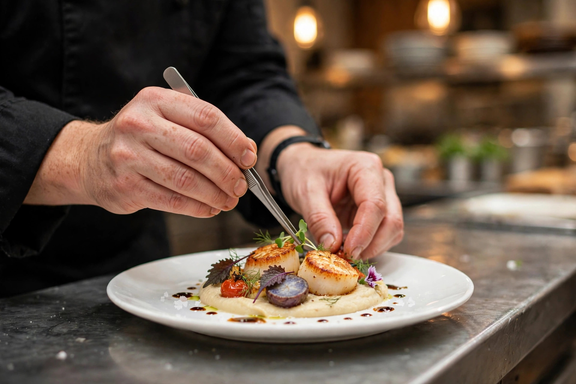
By the time the guest reaches the price at the end of the description (tactic 5), the description has already done its real job: building perceived value. A longer, more evocative description makes the same dish feel worth more. "Chicken" is a commodity; "free-range chicken, thyme jus, roasted root vegetables" is a dish with a story — and stories justify prices.
Menu engineering research consistently finds that descriptive, sensory language lifts both order rates and price acceptance. The mechanism is straightforward: the guest is buying the mental image as much as the food. Name the origin ("Lofoten cod"), the technique ("slow-smoked for six hours"), the craft ("house-made"). Each specific detail is a small deposit in the value account that the price withdraws from at the end of the line.
The two-to-three-line rule
Aim for two to three lines of description per main dish. One line undersells the dish; five lines exhaust the reader. Front-load the appetising words — the guest's attention is highest at the start of the description — and put the price last, per tactic 5. For dietary information and allergens, keep them as compact markers rather than sentences, so they do not dilute the sales copy. If your menu also needs to carry allergen declarations, our guide to website accessibility for restaurants explains how to keep required information readable without wrecking your layout.
A Nordic caution: descriptive copy must stay truthful. "Locally caught" must mean locally caught; "organic" must be certifiable. Nordic guests are unusually attentive to provenance claims, and one exposed exaggeration costs more trust than a hundred good descriptions can rebuild.
Tactic 7: Bundles and set menus
Bundles — set menus, lunch deals, "starter + main" packages — raise the average ticket through a different mechanism: they replace many small decisions with one big one. A guest choosing à la carte might skip dessert. A guest choosing a 3-course set menu at 49 has already committed to dessert before sitting down. The decision fatigue is gone, the kitchen gets predictable covers, and your average ticket climbs.
The pricing psychology inside a bundle is the good–better–best ladder. Offer two or three tiers — 2 courses at 39, 3 courses at 49, 3 courses with wine pairing at 69 — and mark the middle one as the popular choice. Most guests will land in the middle, a meaningful share will upgrade to the top, and almost nobody resents the bottom tier for existing. The key detail from pricing research: the step between tiers must feel like a real upgrade, not a nudge. If "better" is only €5 more than "good", guests smell the manipulation; at €10–€20 more, it reads as a genuine choice.
Bundles that actually work for restaurants
- Weekday lunch sets: the classic Nordic workhorse — a fixed, fast, fairly priced lunch that fills seats at noon.
- Chef's tasting menu: your premium bundle and your best anchor (tactic 3) in one.
- Add-on bundles: "add a dessert for 9" or "upgrade to the seafood starter for 6" at the point of ordering — small commitments with high margins.
Price the bundle so the per-course math is visibly fair — guests do check — but remember that the bundle's real profit comes from the courses the guest would not have ordered separately. That is not a trick; it is the guest buying a complete experience instead of assembling one.
The 9 tactics at a glance
| Tactic | What changes on your menu | Effort | Best for |
|---|---|---|---|
| 1. Drop the € sign | 24 instead of €24 | Minutes | Every concept |
| 2. Charm vs round endings | 18.95 or 42, matched to concept | An afternoon | Matched per section |
| 3. Anchor dish | One premium item at the top of each section | Menu planning | Mid-range and up |
| 4. Decoy option | A middle tier that makes the target look smart | An afternoon | Portions, sets, drinks |
| 5. Nested prices | Prices inside descriptions, no price column | Redesign | Print and digital menus |
| 6. Value-first descriptions | 2–3 lines of sensory copy before the price | Copywriting | Every concept |
| 7. Bundles and set menus | Good–better–best tiered offers | Menu planning | Lunch, tasting, groups |
| 8. Strategic price rises | Small rises on unique dishes first | Ongoing | Every concept |
| 9. Layout and visual cues | Boxes, whitespace, golden-triangle placement | Redesign | Print and digital menus |
Tactic 8: Raise prices without losing regulars
Costs rise — every Nordic restaurant owner knows the feeling — and at some point the menu prices must follow. The psychology of the increase matters as much as the amount. A blanket 8% rise across the whole menu on the same day is the worst way to do it: regulars notice, the story becomes "everything got more expensive", and the visit frequency drops.
The better approach has three parts. First, raise prices on the dishes guests cannot easily compare — your signatures, house specialties, unique preparations. Nobody knows what your truffle arancini "should" cost, so a €2 rise passes unnoticed; everybody knows what a burger costs, so the same rise on the burger gets compared with the place next door. Second, spread increases across two or three menu updates rather than one. Third, add a small visible upgrade alongside the rise — a better side, a premium garnish, a slightly larger portion. The upgrade often costs you a fraction of the price increase, but it reframes the story from "they charged me more" to "I got more".
The Nordic price-rise playbook
Raise unique dishes first, commodity dishes last. Spread rises across menu updates. Pair each rise with a small visible upgrade. Never raise everything at once — regulars forgive a dish getting €1–2 more expensive; they notice, and resent, the whole menu jumping. And remember that Finnish restaurant prices must always be shown VAT-inclusive, so a rise is immediately visible — there is no hiding it in tax lines.
How much, how often
Small, frequent adjustments beat rare, large ones. A €1 rise on a €24 main, twice a year, is absorbed without comment. A €4 jump after three frozen years becomes a talking point. Review your prices quarterly against food costs, and treat the menu as a living document — which is another argument for digital menus you can update in minutes rather than printed menus that lock prices in for a season.
Tactic 9: Layout, boxes and visual cues
The ninth tactic is not about the numbers at all — it is about where the eye goes. Eye-tracking studies of menus consistently show the same pattern: guests read in a rough triangle across the page, landing first on the middle, then the top right, then the top left. The dishes placed in those hot zones get ordered more, regardless of price. Your highest-margin dishes belong in the hot zones; your low-margin crowd-pleasers can survive anywhere.
Boxes and visual calls are the other half of this tactic. A lightly boxed "Chef's recommendation" or a small "Guest favourite" marker draws the eye the way a headline draws a reader. Use them sparingly — one or two per page. A menu where everything is boxed is a menu where nothing is boxed, and a forest of starbursts reads as desperation, not guidance.
Whitespace is a pricing tool
Crammed menus feel cheap; airy menus feel premium. Whitespace around a dish gives it importance, and importance supports price. This is why fine-dining menus can be a single page with twelve dishes while a pizzeria flyer fits sixty — the density itself is a price signal. If your concept sits above fast-casual, give each dish room to breathe. The white space is not empty; it is doing sales work.
Putting all nine tactics to work
You do not need to implement all nine at once — in fact, you should not. Pick the two or three with the best effort-to-impact ratio for your concept: dropping the € sign and nesting prices are nearly free; charm-vs-round endings and the anchor dish take an afternoon; a full layout redesign takes a proper project. Then measure. Record your average ticket for two to four weeks before the change and two to four weeks after, keeping season, weather and holidays in mind. One tactic at a time, one measurement at a time — that is how you turn psychology into profit you can prove.
And when the menu is ready, make sure the world can see it: a fast, mobile-friendly menu page on your own website is where most guests will meet these tactics first. At PowerfulWebsite we build restaurant websites for free — you only pay the monthly plan from €59/month — with menu pages designed around exactly these principles.
Frequently asked questions
How does menu pricing psychology work?
Menu pricing psychology works by shaping how guests perceive cost. Techniques like removing the € sign, using charm pricing (.95 endings), anchoring with a premium dish and nesting prices inside descriptions shift attention from the price to the food. The guest orders more freely — without you changing a single recipe or ingredient.
Why do restaurants remove the euro sign from menus?
The € sign is a reminder that money is leaving the guest's wallet. Research by the Cornell School of Hotel Administration found that diners given menus without currency symbols spent significantly more than those who saw prices with a $ sign or written out in words. A bare number like 24 reads as a detail; €24 reads as a cost.
Should I use .99 endings or round numbers on my menu?
It depends on your concept. Charm pricing — endings like 18.95 instead of 19 — suits value-oriented and casual restaurants, where it makes dishes feel cheaper through the left-digit effect. Fine-dining and premium concepts usually do better with round numbers like 42, which signal confidence and quality instead of bargain-hunting.
What is the decoy effect on a restaurant menu?
The decoy effect uses a strategically priced middle option to steer guests toward your target dish. For example, if a regular portion costs 16 and a large costs 19, the medium option makes the large look like the smart deal, and guests upsell themselves. The middle item exists to make the most profitable choice look reasonable by comparison.
How much can menu pricing psychology increase revenue?
Industry analyses report gains of a few percent in average check size from well-executed pricing moves — which compounds into tens of thousands of euros per year for a busy restaurant. Results vary with concept, price level and execution. The realistic approach is to test one tactic at a time and measure your own average ticket before and after.
Want a menu page that sells as hard as your kitchen cooks?
PowerfulWebsite builds your restaurant's website for free — you only pay from €59/month. Every plan includes a fast, mobile-friendly menu page with nested pricing, allergen notes and online ordering options.
See the plans