Sushi Restaurant Websites: How to Stand Out
Most sushi restaurant websites look identical: a dark background, a stock photo of maki rolls, a PDF menu, and a phone number. To stand out, do the opposite — invest in real photography of your food, tell your chef's story, make the menu readable on a phone, and make booking a table effortless. In the Nordics, where sushi buffets are on every corner, these details are what separate the restaurants people remember from the ones they scroll past.
Key takeaways
- Sushi websites are commoditised: dark templates, stock photos and PDF menus everywhere. Real photography of your actual food is the fastest differentiator.
- Show the people: chef profiles, sourcing stories and omakase details build the trust that makes guests choose you over the buffet next door.
- Make the menu readable on a phone — no PDF downloads. Most guests decide where to eat on mobile, minutes beforehand.
- Put reservations and takeaway ordering directly on the site; every extra click to a third party costs you bookings.
- Local SEO wins the "sushi near me" searches: a complete Google Business Profile, genuine reviews and neighbourhood keywords beat a pretty homepage.
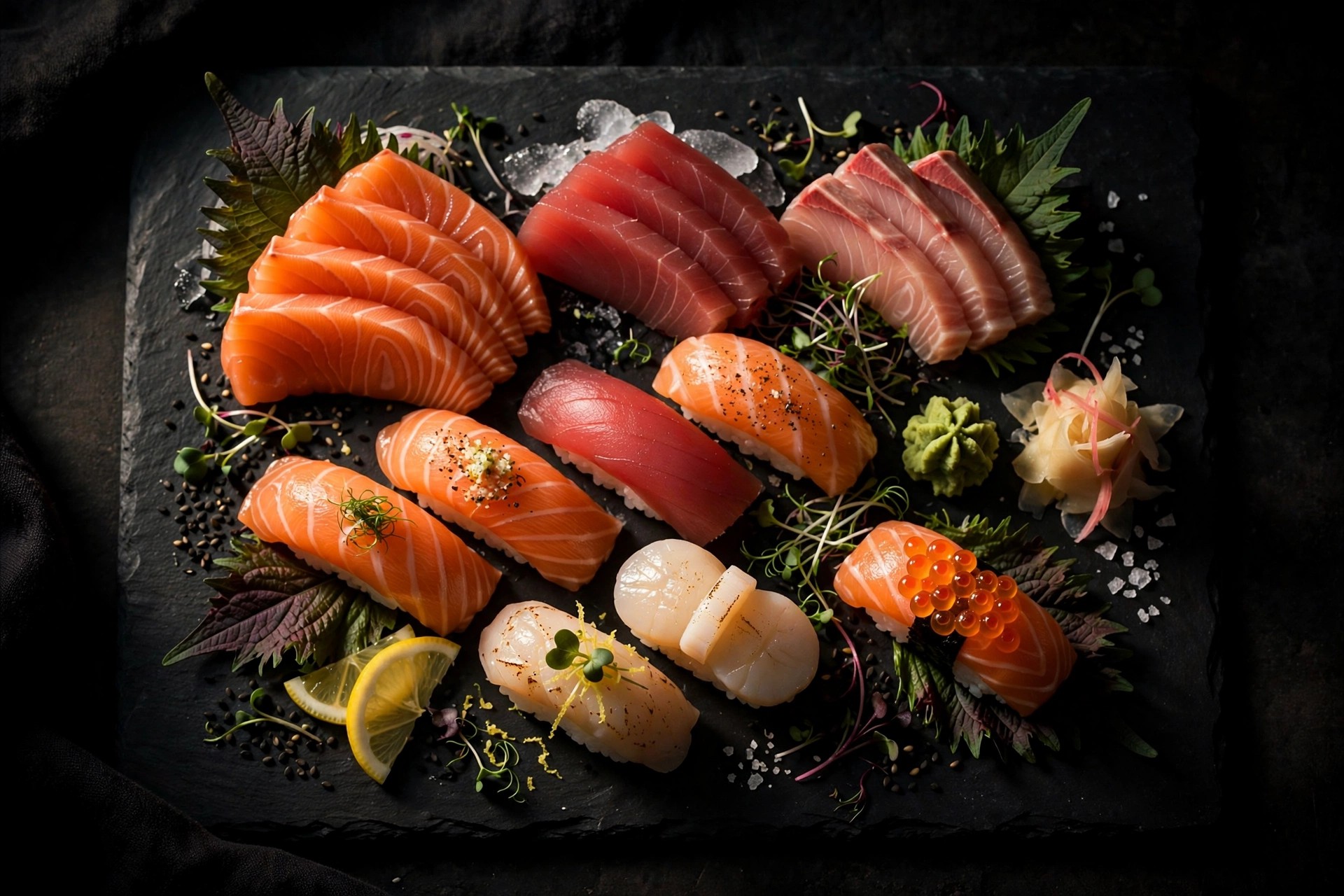
Sushi might be the most competitive restaurant category in the Nordic capitals. Helsinki, Stockholm and Oslo each have dozens of sushi spots ranging from €12 lunch buffets to €150 omakase counters — and online, they nearly all look the same. The same dark template. The same stock photo of salmon nigiri. The same downloadable PDF menu. The same "call to reserve" as the only action.
That sameness is your opportunity. A sushi restaurant website doesn't need gimmicks to stand out; it needs the fundamentals done with unusual care — photography that shows your actual food, a story that explains why your sushi is different, a menu a hungry person can read on a phone in ten seconds, and booking that takes fewer clicks than opening a delivery app. This guide covers each of those, with the specifics that matter for sushi restaurants in the Nordics.
Why sushi websites all look the same (and why that's your opportunity)
Open ten sushi restaurant websites in any Nordic city and you'll see the pattern within seconds: black background, red accents, a hero image of maki rolls that could be from any restaurant on earth, a menu buried in a PDF, and contact details in the footer. It's not that these sites are broken — most of them work fine. It's that they're interchangeable.
There are structural reasons for the sameness. Sushi restaurants skew small and owner-operated, so websites get built on the cheapest template available. The cuisine's visual language — dark wood, red, black, white — is so established that deviating feels risky. And because so much sushi business comes from walk-ins and delivery apps, the website has historically been an afterthought: a digital business card rather than a sales tool.
But guest behaviour has shifted. Even for a cuisine people think they know, the decision increasingly happens online: a Google search for "sushi near me", a scan of photos and reviews, a glance at the menu, then a booking or an order. When every site looks the same, the restaurant that breaks the pattern — with real photos, a real story and a frictionless booking — captures the guests who are actually choosing rather than defaulting. In a market as saturated as Nordic sushi, "slightly better website" compounds into real revenue.
There's a second, quieter shift worth noting: AI search. When someone asks a voice assistant or an AI overview "where should I eat sushi tonight near me", the answer is assembled from structured, quotable content — clear menus, FAQ-style pages, review signals — not from pretty homepages. The restaurants whose websites directly answer real questions are the ones these systems cite. Every section below is written with that in mind: not just humans reading, but machines summarising.
Photography first: your single biggest advantage
If you do one thing after reading this article, make it this: replace every stock photo on your website with real photographs of your food, your counter and your people. Nothing else you can do to a sushi website moves the needle as much.
Sushi is an intensely visual cuisine — colour, arrangement, precision are the product — and guests know it. According to the DoorDash Delivery Trends Report, 43% of Gen Z diners say food photos influence where they order from. Your website's photography is doing the same job for dine-in guests: it's the closest thing to tasting the food before committing.
What good sushi photography looks like
You don't need art-directed magazine shoots. You need sharp, well-lit, honest photos: close-ups of nigiri that show the cut of the fish, an overhead of a sashimi platter, the chef's hands at work, the counter at golden hour. Shoot in natural light near a window, keep backgrounds simple, and photograph the dishes you actually serve — guests notice when the website promises one thing and the table delivers another. Ten excellent photos beat fifty mediocre ones.
Phone vs. professional: an honest breakdown
A modern smartphone in good light produces perfectly usable website photos — many of the best-looking independent restaurant sites are shot this way. The investment is an afternoon, a clean lens, and someone with an eye for plating. Professional food photography (€300–€1,500 for a session in the Nordics, as a rough estimate) buys you consistency, perfect lighting and styling across dozens of dishes — worth it if you're launching, rebranding, or running an omakase concept where the visuals are the positioning. Either way, add descriptive alt text to every image ("salmon nigiri with fresh wasabi at [restaurant]") — it helps search engines understand your photos and makes the site accessible.
Ten excellent photos of your actual food beat fifty mediocre stock images every time.
Tell the story behind the counter
Here's what the buffet next door can't copy: your people and your standards. Sushi guests — especially at mid-range and above — are buying trust as much as fish. Your website should answer the questions a discerning guest asks before choosing: who makes this, where does the fish come from, and why should I believe it's good?
The chef's profile
A short chef profile with a real photo does more for conversions than any design trick. Name, background, years behind the counter, philosophy in two sentences. It doesn't need to be a Michelin-starred biography — "trained in Osaka, eight years in Helsinki, obsessed with proper rice temperature" is compelling because it's specific. Anonymous sushi is commodity sushi; a named chef is a reason to choose.
Where the fish comes from
Sourcing transparency is a genuine differentiator in the Nordics, where guests care about provenance. Name your suppliers or markets, mention what's flown in from Japan versus sourced locally (Norwegian salmon, for instance, is a point of pride, not a compromise), and note seasonal fish. This content also feeds your search visibility — "fresh bluefin tuna Helsinki" is a search someone makes when they're ready to spend.
Explain omakase for first-timers
If you offer omakase or a tasting menu, dedicate a page to it. Many potential guests are curious but intimidated: what does omakase mean, how long does it take, how much does it cost, what if I don't like something? A short "what to expect" section — the number of courses, the price, the duration, dietary accommodations — converts curiosity into bookings. It's also exactly the kind of content AI search overviews and voice assistants quote.
The menu: make it readable on a phone
The menu is the most-visited page on any restaurant website, and for sushi restaurants it's where most sites fail hardest. The classic failure: a PDF download that renders as microscopic text on a phone, can't be searched, and tells Google nothing about your dishes. Kill the PDF.
Build the menu as a real web page
Your menu should be HTML text on a page: readable without pinching and zooming, searchable by Google, translatable by the browser, and easy for you to update when prices change. Structure it the way guests scan: categories first (nigiri, maki, sashimi, sets, lunch), then items with one-line descriptions and prices. A guest deciding between you and the place across the street does it in under a minute — usually standing on the pavement.
Prices and practical details up front
Sushi pricing confuses people — per piece? per set? lunch vs. dinner? State it plainly: "Nigiri priced per piece (2 pcs)", "Lunch sets served 11:00–14:00". Include allergen and dietary notes (gluten-free tamari on request, vegetarian options) — in the Nordics this isn't a nice-to-have, it's expected, and it's a search advantage: "gluten-free sushi [city]" has real volume and almost no competition. If your site needs a broader mobile optimisation checklist, start there — the menu page is where mobile issues hurt most.
The 10-second menu test
Open your menu page on your phone, with one thumb, standing up. Can you find the price of a salmon nigiri set within 10 seconds? Can you read it without zooming? If not, you're losing the guests who are hungriest — the ones deciding right now. Fix the menu before you redesign anything else.
Reservations and takeaway, done right
A sushi website has two jobs after informing: converting interest into a booked table or a placed order. Every step between "I want sushi" and the confirmation is a place guests leak away. Compare your options honestly:
| Phone number only | Email / contact form | Booking platform widget | Built-in reservations + ordering | |
|---|---|---|---|---|
| Guest effort | High — must call during opening hours | Medium — write, then wait for a reply | Low — pick a time, done | Lowest — book or order without leaving your site |
| No-show protection | None | None | Often includes reminders | Reminders + confirmation flow |
| Typical cost | €0 | €0 | Monthly fee or per-cover charge | Bundled in subscription (e.g. €239/mo Restaurant tier) |
| Best for | Tiny counters with regulars | Catering and large-group enquiries | Mid-size restaurants with steady bookings | Restaurants doing both dine-in and takeaway |
The right answer depends on your mix. A 12-seat omakase counter lives or dies by reservations — a proper booking flow with confirmations and reminders is non-negotiable. A neighbourhood spot doing heavy takeaway needs ordering more than bookings. What doesn't work for anyone in 2026: a phone number as the only option. A large share of your potential guests — younger diners especially — will simply choose the competitor whose booking took thirty seconds over calling a stranger.
Keep the action visible everywhere: a sticky "Book a table" button on mobile, the phone number in the header, opening hours on every page. And if you take orders through delivery apps, link them — but try to offer direct ordering too, since the commission on every third-party order adds up fast.
A phone number as the only booking option means a share of your guests will choose the competitor whose booking took thirty seconds.
Local SEO: win the "sushi near me" search
Most sushi guests aren't searching for your restaurant by name — they're searching for sushi near them, right now. "Sushi near me", "best sushi Oslo", "omakase Stockholm": these searches have fierce intent, and the restaurants that win them win the walk-in trade. The good news is that local SEO for restaurants is straightforward and mostly free.
Your Google Business Profile is your real homepage
For "near me" searches, your Google Business Profile (formerly Google Business) matters more than your website. Claim and verify it, choose the right categories ("Sushi restaurant" as primary), keep hours current — including holiday hours — upload 20+ real photos, and respond to every review, good and bad. A complete, active profile is what gets you into the local results; most competitors set theirs up once and never touch it again.
Reviews are your ranking fuel
Review count, rating and recency all feed local rankings — and for sushi, where trust matters, they feed guest decisions too. Ask happy guests for reviews systematically (a small card with the bill, a follow-up for regulars), and respond to every single one. A thoughtful response to a critical review impresses future guests more than a dozen five-star ratings.
Speak your neighbourhood's language
Your website should say where you are in words, not just on a map. Page titles and headings like "Sushi restaurant in [district]" and "Omakase in [city]" match how people actually search. If you serve multiple areas or run lunch deals for nearby offices, say so on the site — "5 minutes from [station/landmark]" is both a keyword and a genuinely useful detail. Keep name, address and phone number identical everywhere you're listed; inconsistencies confuse Google and cost you rankings.
Design details that signal quality
Sushi carries an aesthetic expectation — precision, restraint, craft — and your website either confirms it or undermines it. You don't need an expensive custom design; you need disciplined choices.
Restraint beats decoration
The best sushi restaurant sites share a trait: generous white (or black) space, one strong hero image, clear typography, and nothing that moves without a reason. Resist the animated fish, the falling cherry blossoms, the autoplay video with sound. Every decorative element is a small tax on loading speed and a small dent in the calm, precise feeling sushi is supposed to evoke. If your current site feels busy, our guide to the signs your restaurant website needs a redesign is a useful audit.
A Japanese-inspired visual language, done tastefully
Indigo blues, warm wood tones, deep reds used sparingly, generous negative space — the Japanese design tradition is a gift to restaurant websites because it photographs and reads as quality. The line to avoid: theme-park Japan. A kanji character as a decorative watermark, brush-stroke dividers on every section, and "exotic" stock imagery reads as a costume. One or two considered touches (a restrained accent colour, a vertical text detail, real calligraphy of your restaurant's name) signal authenticity; ten signal a template.
Typography and readability
Pick one clean serif or elegant sans for headings and one highly legible sans for body text, and stop there. Body text should be at least 16px, with strong contrast — light grey text on a dark background, the sushi-site cliché, is often genuinely hard to read on phones in daylight. Test your site outside, in sunlight, on a mid-range phone: that's where your guests are reading it.
Five mistakes sushi restaurants keep making online
- The PDF menu. Unreadable on phones, invisible to Google, painful to update. Rebuild it as a web page — it's the highest-ROI change on this list.
- Stock photos of someone else's sushi. Guests can tell, and it quietly signals that the real food isn't worth photographing. Shoot your own, even on a phone.
- No prices. "Market price" for everything, or no prices at all, reads as expensive and scares off exactly the curious first-timers you want. Publish prices; it builds trust.
- Japanese-only navigation labels. "Omakase", "Nigiri", "Izakaya" as the only menu labels confuse newcomers. Use both: "Omakase — chef's tasting menu". Enthusiasts feel respected, beginners feel welcome.
- English forgotten. In Nordic capitals, a large share of sushi guests — tourists, expats, business diners — search and book in English. A site in only the local language quietly turns them away. Our Nordic guide to bilingual restaurant websites covers how to do two languages without doubling your maintenance.
None of these require a rebuild — most are an afternoon's work each. But together they explain why two sushi restaurants on the same street, with equally good fish, can have very different booking calendars. For the full picture of what a premium restaurant site can look like, see our guide to fine dining website design.
Anonymous sushi is commodity sushi. A named chef, a real story and honest prices are reasons to choose.
Frequently asked questions
What should a sushi restaurant website include?
At minimum: a mobile-readable menu with prices, opening hours, address with a map, a prominent reservation or order button, real photos of your food and interior, and a short story about the restaurant and the chef. Nice to have: an omakase or tasting-menu page, a Google reviews feed, and pages in the local language plus English.
How much does a sushi restaurant website cost?
A DIY builder site costs roughly €100–€400 per year plus your time; a freelancer typically charges €500–€2,000 for the build; an agency €2,000–€10,000+. Subscription services like PowerfulWebsite build the site free and charge €59–€239/month including hosting, maintenance and updates.
Do sushi restaurants need online ordering on their website?
If you do meaningful takeaway or delivery volume, yes — guests increasingly expect to order directly, and every extra click to a third-party app loses orders. For a dine-in-only omakase counter, a reservation system matters far more than an ordering button.
How do I get my sushi restaurant to show up on Google?
Start with a complete, verified Google Business Profile: correct categories, current hours, 20+ real photos, and review responses. Then make sure your website mentions your cuisine and neighbourhood in its headings and page titles — e.g. "sushi restaurant in [district]" — loads fast on mobile, and earns a steady stream of genuine Google reviews.
Should my sushi restaurant website be in more than one language?
In the Nordics, yes — at minimum the local language plus English. Tourists, expats and international business diners make up a large share of sushi guests in cities like Helsinki, Stockholm and Oslo, and they search and book in English. Two languages is enough for most restaurants; add more only if a specific guest group justifies it.
Want a website that brings table bookings?
PowerfulWebsite builds your restaurant website free — you only pay a monthly fee from €59/mo. Everything included: domain, hosting, maintenance and updates. See how it works.
See the plans