Mobile-Friendly Restaurant Website: The 2026 Checklist
A mobile-friendly restaurant website loads in under 3 seconds, shows the menu as readable text, and puts call, directions and booking buttons within thumb reach. Run the 12-point checklist below on your own phone — most restaurant sites fail at least three items, and the fixes are usually quick.
Key takeaways
- 60–70% of restaurant website visits happen on phones — design for the phone first, desktop second.
- Google ranks the mobile version of your site; a poor mobile experience directly hurts local visibility.
- The menu must be real text, readable without zooming — PDF menus fail the mobile test instantly.
- Call, map and booking buttons need to be tappable with one thumb: at least 44×44 pixels, well spaced.
- Run the 12-point checklist on your own phone quarterly — mobile behaviour and expectations keep evolving.
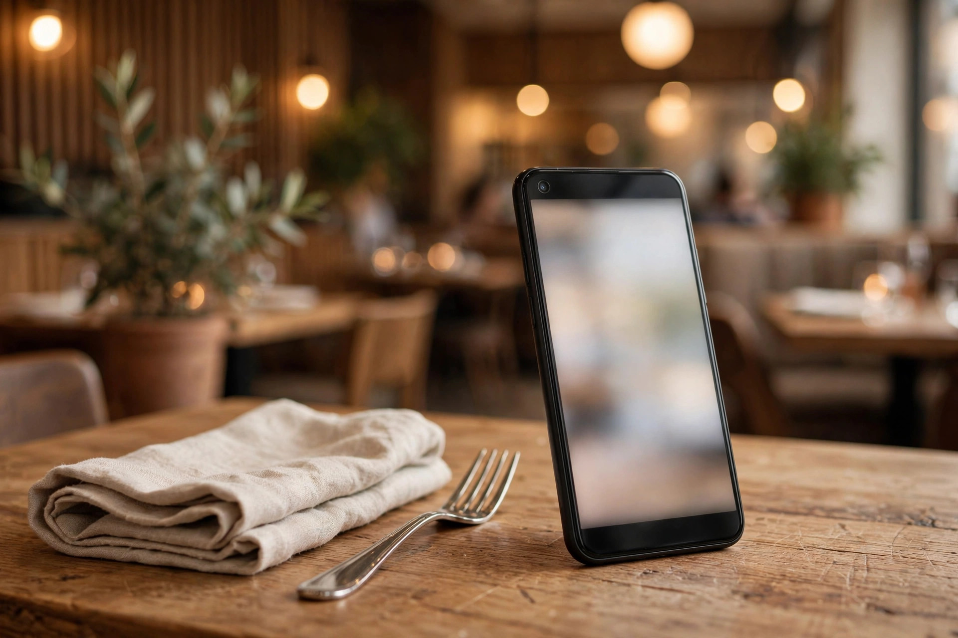
Your restaurant has two front doors. One is the physical entrance with its sign, lighting and the smell of good cooking. The other is a 15-centimetre screen in a stranger's hand, seen for maybe ten seconds, usually while that stranger is hungry and slightly impatient. For most restaurants in 2026, the second door gets more traffic than the first.
This checklist is the practical standard for a mobile-friendly restaurant website in 2026. It covers what Google expects, what guests expect, and the restaurant-specific details — menus, bookings, calls, maps — that generic mobile guides miss. Work through it on your own phone; every item is a concrete test with a clear pass mark. No developer required for the audit, and many of the fixes are quick wins you can do yourself or hand to whoever manages your site.
Mobile is where your guests decide
The numbers leave little room for debate. Around 60% of all web traffic globally now comes from mobile devices, and for restaurants the share runs higher — analyses of restaurant sites typically find 60–70% of visits on phones. The intent is different too: industry research has found that roughly two-thirds of local food searches happen on mobile, and younger diners browse the menu on the way to the venue as a matter of routine.
Think about the actual moments a mobile guest meets your site:
- The street-corner decision: "sushi near me", standing outside, comparing three restaurants. The winner is the site that shows the menu, hours and a booking button fastest.
- The commute browse: scrolling on the tram home, picking Friday's dinner. Photos and reviews matter here — and so does a site that doesn't make them wait.
- The tourist check: a visitor on hotel Wi-Fi or roaming data, verifying you're open and finding the address. They need practical info, instantly, possibly in a second language.
- The group chat referral: someone drops your link in a chat; four friends open it on four different phones. If it renders badly on any of them, the group picks somewhere else.
None of these guests are sitting at a desk admiring your desktop design. The Nordic twist: our guests are often doing this outdoors, in winter, with gloves on, in fading daylight — which makes big tap targets and high-contrast text a genuine usability issue, not a nice-to-have. A button that's merely "okay" in a warm office is unusable with cold fingers on a rainy evening in Bergen.
Google judges the mobile version — not the desktop one
Since Google moved to mobile-first indexing, it primarily crawls and ranks the mobile version of your pages. Whatever your desktop site does is secondary. This has three practical consequences for restaurants:
Your mobile content is your SEO content
If your mobile site hides the menu behind a tab, shows a shortened version of your story, or drops the structured data your desktop version has, Google ranks the thinner version. Content parity — same text, same images, same structured data on mobile and desktop — is a baseline requirement, not an advanced tactic.
Mobile page experience feeds local rankings
Google's Core Web Vitals (loading speed, interactivity, visual stability) are measured on mobile. In local searches — "ramen Oslo", "brunch Copenhagen" — where several restaurants compete on similar relevance, the faster, more stable mobile experience can be the tiebreaker that puts one restaurant in the visible results and another below the fold.
Mobile usability errors are reported to you directly
Google Search Console has a mobile usability report that flags concrete problems: text too small to read, clickable elements too close together, content wider than the screen. If you do nothing else from this article, check that report once — it's Google telling you exactly what's wrong, for free.
The 2026 mobile checklist: 12 tests
Work through this table on your own phone. Each row is a test, what to check, and the pass mark. Be honest — "it sort of works" is a fail.
| # | Test | How to check | Pass mark |
|---|---|---|---|
| 1 | Responsive layout | Open your site and rotate the phone; try it on a small and a large phone if you can | Content reflows, nothing overflows, no horizontal scrolling |
| 2 | Readable text | Read a paragraph and the menu without zooming | Body text at least 16px, comfortable line spacing, good contrast |
| 3 | Tap targets | Try tapping every button and menu link with your thumb | At least 44×44 pixels, clear space between neighbouring targets |
| 4 | Menu readability | Open the menu page as a first-time guest would | Real text, readable without pinch-zoom; prices and dietary marks visible |
| 5 | Click-to-call | Tap the phone number | Opens the dialler immediately (a proper tel: link, not plain text) |
| 6 | Directions | Tap the address | Opens the maps app with your location pinned |
| 7 | Booking / order flow | Complete a booking or start an order on the phone | Works one-handed, no broken steps, confirmation clearly shown |
| 8 | Load speed | Run PageSpeed Insights, mobile tab | Main content visible within 2.5–3 seconds; score 80+ |
| 9 | Visual stability | Watch the page load; try tapping a button as it loads | Nothing jumps or shifts under your thumb (no layout shift) |
| 10 | Forms | Fill in the booking or contact form on the phone | Right keyboard per field (numeric for phone), autofill works, errors shown inline |
| 11 | No intrusive popups | Load the homepage fresh | No full-screen popup on entry; cookie banner is compact and dismissible |
| 12 | Thumb-zone actions | Use the site one-handed | Call, menu and booking reachable without hand gymnastics; sticky bars don't cover content |
Count your passes. Nine or more: your mobile experience is in good shape — polish the failures. Six to eight: guests are hitting friction every visit; schedule the fixes this month. Below six: your mobile site is actively costing you guests, and a focused overhaul will pay for itself. The sections below go deeper on the items restaurants most often fail.
Your menu on a phone: the make-or-break test
Restaurant web research consistently finds the menu is the most-visited page on restaurant sites — and the page that most directly drives the decision to visit. On mobile, the menu is also where most sites fail hardest. Here's what the test looks like through a guest's eyes.
The PDF menu fails instantly
A PDF menu on a phone means: wait for the download, wait for the render, then pinch and zoom around a document designed for A4 paper. It is slow, unreadable, invisible to Google and unusable with a screen reader. If your menu is a PDF, this single change — converting it to a real text page — is the highest-impact mobile fix most restaurants can make. Our café website design guide makes the same point for coffee shops; the logic is identical for restaurants and bars.
What a mobile-friendly menu looks like
- Real text, structured with headings: starters, mains, desserts as proper sections — readable by guests, Google and screen readers alike.
- Prices inline with every dish: guests should never have to hunt for what things cost.
- Dietary markings as text or symbols with a legend: vegetarian, vegan, gluten-free options clearly marked — a major decision factor for group bookings.
- Short, appetising descriptions: one line per dish is enough on mobile; the full poetry can live on the desktop layout.
- Sticky section navigation: on a long menu, small jump-links (Starters · Mains · Desserts) pinned near the top save endless scrolling.
- Photos used sparingly: a few compressed, lazy-loaded dish photos enhance; a photo per dish bloats the page and slows everything down.
Multilingual menus for tourist cities
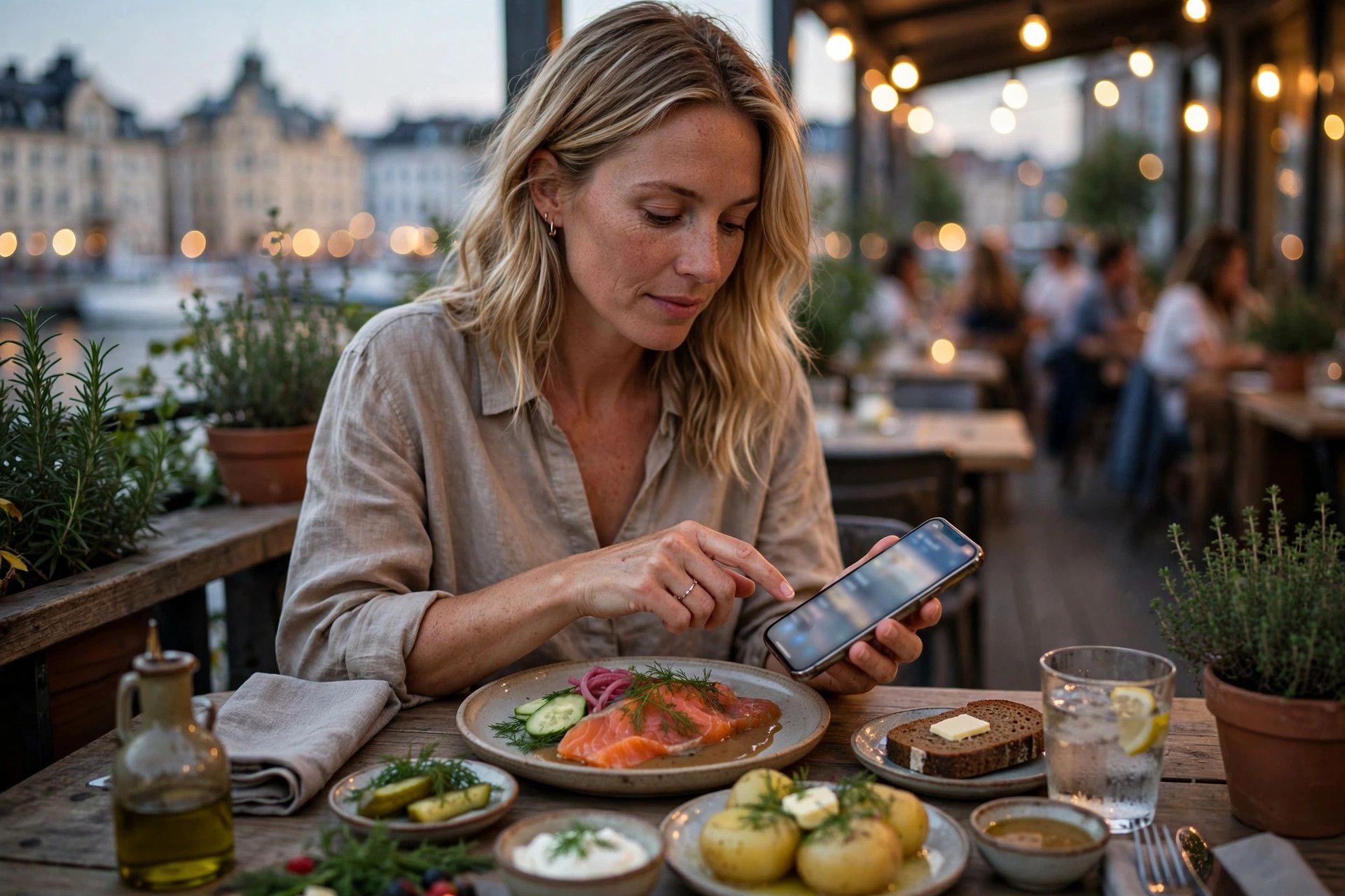
If you serve tourists — and in Helsinki, Stockholm, Oslo, Copenhagen or Bergen you do — an English version of the menu is worth more than any design flourish. A simple language toggle on the menu page removes the single biggest friction point for international guests. Full site translation is nice; a translated menu is essential.
Bookings, calls and orders: thumb-friendly conversions
Every mobile visit has a job to do: book a table, call the restaurant, get directions, or place an order. Your site's mobile design should make each of these achievable in seconds, one-handed. Audit each path:
Click-to-call that actually works
Your phone number must be a real link (tap → dialler opens), not plain text the guest has to memorise or copy. Put it in the header on mobile — visible without scrolling — and again on the contact page. Test it yourself: on some sites the number is an image, which is completely untappable. That's a fail.
Directions in one tap
Your address should open the guest's maps app with your location pinned. Embed a small map on the contact page for orientation, but the address link itself is what gets used. Double-check the pin is on the right door — a surprising number of restaurants have their map pin on the wrong side of the street, and no mobile optimisation fixes a guest standing at the wrong entrance.
Booking flows that survive the phone
Walk through your own booking flow on a phone, slowly. Common failures: date pickers that don't fit the screen, party-size dropdowns that reset, forms that wipe everything when one field errors, confirmation pages that never load. Each broken step doesn't just lose that booking — it teaches the guest to call a competitor next time. If your booking widget is third-party, test it after every update; widgets break silently.
Ordering without the obstacle course
If you take online orders, the mobile ordering path should be: menu → add items → checkout, with as few steps as possible. Every extra screen — account creation, upsell popups, newsletter checkboxes — costs you orders. Guest checkout (no account required) is the single biggest conversion lever for mobile food ordering. For more on structuring the ordering journey, see our pizzeria website guide — the ordering principles apply to every cuisine.
The glove test
Try using your site wearing winter gloves. If buttons are too small, too close together, or require precise taps, they'll fail for a meaningful share of Nordic guests for half the year. 44×44 pixels is the minimum; 48–56 pixels is more comfortable. This is the cheapest usability test you'll ever run.
Speed matters more on mobile
Mobile guests are on slower connections, weaker processors and smaller patience reserves than desktop visitors. A site that feels "fine" on office Wi-Fi can be painful on a train. The targets: main content visible within 2.5 seconds, full interactivity soon after, no layout jumps.
The usual mobile speed killers on restaurant sites are heavy hero images, autoplaying video backgrounds, PDF menus and third-party widgets (booking systems, review carousels, chat bubbles) that load before the content. The fixes — compressing images to under 200 KB, lazy-loading below-the-fold content, deferring non-essential scripts, enabling caching — are covered step by step in our companion guide to restaurant website speed tests and 30-minute fixes. Speed and mobile optimisation are really one discipline: a fast site is a mobile-friendly site, and vice versa.
Video backgrounds: just say no (on mobile)
A cinematic video of your kitchen looks stunning on a desktop showreel and terrible on a phone: it eats mobile data, slows everything, and often doesn't even play until tapped. Serve a single optimised still image to mobile visitors instead. Your data-conscious guests — and anyone on a capped tourist SIM — will thank you.
7 mobile mistakes that cost restaurants guests
- Text too small to read. If guests pinch-zoom to read the menu or the opening hours, the text is too small. Body copy should be at least 16px on mobile — smaller text also hurts your Search Console mobile usability report.
- Buttons too close together. "Book a table" and "View menu" side by side with no spacing means mis-taps, frustration and accidental calls. Space tap targets generously.
- The desktop-only booking widget. Some booking systems render a tiny desktop iframe on phones. If your booking provider's mobile experience is broken, the booking provider is broken — switch or escalate.
- Full-screen popups on entry. A newsletter popup covering the whole screen the moment the page loads is the fastest way to send a hungry guest back to Google. Delay popups, or better, don't use them on mobile at all.
- Cookie banners that eat the screen. EU law requires consent banners, but they don't have to be full-screen monstrosities. A compact bottom banner with clear accept/reject options complies and stays out of the way.
- Outdated opening hours. Nothing destroys trust faster than driving across town to a closed restaurant. Holiday hours, summer hours, exceptional closures — the mobile guest checks hours more than any other info. Keep them current everywhere: your site, Google Business Profile, social media.
- Ignoring landscape and tablets. Guests browse tablets at home when planning; phones get rotated for videos and maps. A quick check in both orientations catches layout bugs that portrait-only testing misses.
The five-minute self-audit on your own phone
You don't need tools for the first pass — just your phone and a guest's mindset. Once a quarter, do this:
- Minute 1: Open your homepage fresh (private browsing, so no cached version). What's visible without scrolling? You should see the restaurant name, what kind of food it is, and one clear action.
- Minute 2: Find the menu, the opening hours and the phone number. Count the taps. More than three taps for any of them is too many.
- Minute 3: Start a table booking (you can abandon before confirming). Note every point of friction: tiny fields, broken pickers, confusing steps.
- Minute 4: Scroll the whole homepage slowly. Anything jump, shift or pop in late? Any image that loads visibly slowly?
- Minute 5: Run PageSpeed Insights on the homepage and note the mobile score and the date. Compare with last quarter.
Write down what failed and fix the top three items — or hand the list to whoever manages your site. Then put a recurring calendar reminder for next quarter. Mobile expectations move fast: what felt modern in 2024 feels dated in 2026, and a site nobody audits slowly rots. For the full technical picture behind the speed items, our bar website essentials guide covers the same mobile principles for drinks-led venues.
And if the audit reveals that your site needs more than tweaks — a rebuild on a properly mobile-first foundation — that's exactly what PowerfulWebsite does: we build the site free, you pay a monthly subscription from €49, and mobile performance is engineered in from the first pixel rather than patched on afterwards.
Frequently asked questions
Why is mobile optimization so important for restaurant websites?
Most restaurant website visits come from phones — guests search while hungry, on the street, choosing between you and the next restaurant. Google also ranks your site based on its mobile version, so a poor mobile experience means worse visibility in "near me" searches and fewer calls, bookings and orders.
What share of restaurant website traffic comes from mobile?
Around 60% of all web traffic globally is mobile, and for restaurants the share is typically higher — industry analyses put 60–70% of restaurant website visits on phones, with the majority of "near me" food searches happening on mobile. Treat the phone as your primary storefront, not a side channel.
How do I check if my restaurant website is mobile friendly?
The quickest test: open your site on your own phone and try to do what a guest does — find the menu, the opening hours, the address and the phone number, all one-handed. Then run Google's PageSpeed Insights for the mobile score and check Google Search Console's mobile usability report for technical issues like text too small or tap targets too close together.
Does mobile friendliness affect my Google ranking?
Yes. Google uses mobile-first indexing, meaning it primarily evaluates the mobile version of your pages when ranking them. A site that is hard to use on a phone can rank lower in local searches, and poor mobile engagement (quick bounces back to the results) further signals that the page didn't satisfy the searcher.
Should I build a separate mobile site or use responsive design?
Use responsive design — one website that adapts to every screen size. Separate mobile sites split your SEO authority, double your maintenance work, and Google explicitly recommends against them. Every modern website builder and theme is responsive by default; the work is in checking that it actually behaves well on a phone, not in building a second site.
Want a website that's mobile-first from day one?
PowerfulWebsite builds your restaurant's website for free — you only pay from €49/month. Everything included: domain, hosting, maintenance and updates. Designed thumb-first for the guests who find you on their phones.
See the packages